Visual Branding & Web Design
From Family Farm to Public Legacy
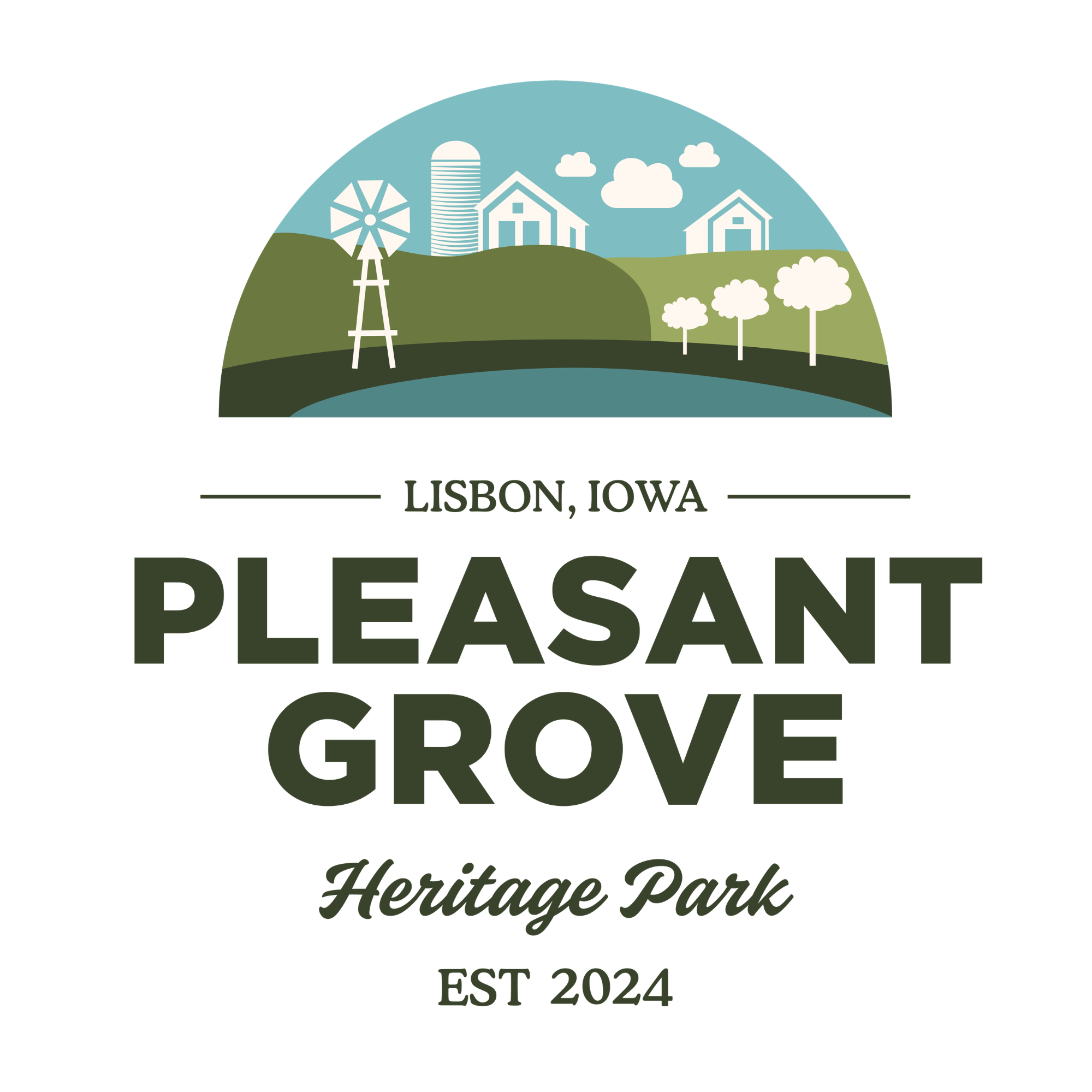
A solo branding and website project for Pleasant Grove Heritage Park – a historic farmstead in Lisbon, Iowa, entering a new chapter as a beloved community destination.
Client
Pleasant Grove Heritage Park
Role
Designer & copywriter
Deliverables
Brand identity & website
Overview
My family’s story begins in a tiny Iowa town. My grandparents raised sheep, horses, and four children on a small farmstead in Lisbon, Iowa. I grew up feeding the animals, playing hide and seek in the barns, and fishing in the pond whenever I’d visit – unaware of the rich agricultural history I was surrounded by.
When my family decided to revitalize the property into a community park and preserve the historic farmstead buildings, they turned to me to create a formal brand identity and public-facing website.
The Challenge
Before this project, Pleasant Grove Heritage Park had no unified visual identity and no website — just the land, the people who loved it, and a vision.
For a nonprofit park navigating the formal process of historic preservation while simultaneously trying to build community awareness and programming, the absence of a brand wasn't just a design gap. It was a barrier to credibility, fundraising, and connection.
Without a website, the park also had no way to communicate programming, share the history it was working to document and preserve, or give potential visitors the basic information they'd need — hours, location, what to expect. Every touchpoint was word-of-mouth, which works until it doesn't.
Research
Before opening Illustrator, I spent significant time in discovery – both with the people who knew this land best and in the primary sources that documented its history.
Stakeholder Conversations
Spoke with family members on the park's board to understand what the park meant to them, what they hoped visitors would feel, and what values were non-negotiable in how the park presented itself.
Photo Archives
Gathered historical photographs from family members and the land's previous owners. These images became both reference material for brand direction and key visual assets for the website.
Historic Documentation
Reviewed the draft National Register of Historic Places application for the farmstead – a rich source of architectural, agricultural, and genealogical detail that informed the visual language.
Comparable Venues
Analyzed the branding of similar nonprofit parks, heritage sites, and event venues across the Midwest to identify conventions worth following – and conventions worth breaking.
Key Insights
Historic photos showed striking architectural details – fences, barns, silos – that could inspire graphic motifs without being literal.
Many comparable heritage sites over-indexed on sepia tones and Victorian serifs, making them feel dusty. There was an opportunity to feel both historic and fresh.
The park's community benefit – open space, gathering place, educational resources – was as important to the board as the history itself. Both needed representation.
Future visitors would range from local families to history enthusiasts to event planners. The website needed to serve all three without feeling fragmented.
Design
With research in hand, the creative process unfolded in two distinct phases: brand identity first, then the website built on top of it.
Phase One: Visual Identity
Moodboard Curation
Developed curated moodboards drawing from the research phase – combining historic agricultural graphics, nature-forward color palettes, and examples of heritage branding done well.
Moodboards were organized around different directional "moods": one leaning into pastoral warmth, one more minimal and archival, one grounded in the natural landscape itself.
Board Review & Iteration
Presented first drafts to the park board and facilitated a structured feedback session. Rather than asking for open-ended reactions, I presented specific questions: What feels right? What feels off? What's missing?
Multiple rounds of refinement followed, each tightening the mark and color system. The final identity emerged from genuine dialogue, not top-down imposition.
First Draft Concepts
Using Adobe Illustrator, developed initial logo and identity concepts rooted in the moodboard direction the board responded to most.
The mark needed to work at small scale (email signatures, social media) and large scale (signage, print) — and needed to feel immediately legible as a heritage destination, not a corporate entity.
Final Brand System Delivery
Delivered a complete brand system: primary and secondary logo lockups, color palette, typography pairings, and supporting graphic elements drawn from the park's architecture and natural setting.
The system was designed to be maintainable by a small volunteer-run nonprofit.
Phase Two: Web Design
Site Architecture & Layout
Mapped out the site structure based on the three primary visitor types identified in research: the curious local, the history enthusiast, and the event planner.
Designed page layouts in Squarespace that strategically integrated historic photography with the new brand system – using archival images not as decoration, but as evidence of the place's depth.
Copywriting for Every Page
Wrote all website copy from scratch, translating the historical research and stakeholder conversations into clear, warm, accessible language. The voice needed to feel personal – this is a family's land and a community's park – without being insular.
Every page was written with the first-time visitor in mind: someone who might not know the history yet, but should feel invited into it.
Review & Revisions
Shared full site drafts with the board in stages. Iterated on both design and copy based on their notes, with particular attention to getting the historical content accurate and complete.
The board's proximity to the material made them essential collaborators on anything touching the park's story.
Launch
Published and launched the completed website, establishing Pleasant Grove Heritage Park's first digital home – and the first place anyone outside the family's immediate network could learn what this park is, why it matters, and how to visit.
Solution
The final brand and website for Pleasant Grove Heritage Park strikes the balance the board had envisioned: deeply rooted in the land's real history, and genuinely welcoming to anyone encountering it for the first time.
Grove Sage
#6B783F
Tallgrass Shadow
#39432B
Prairie Midnight
#1F1E23
Prairie Sky
#7EBDC2
River Bend Teal
#518687
Lisbon Cream
#FFF7EF
Reflections
Working with stakeholders who have a deep personal connection to the subject requires extra care – feedback isn't just an aesthetic preference; it's often tied to memory and meaning. Building in structured feedback methods helped separate emotional reaction from actionable direction.
Historic photos varied enormously in resolution and quality. Decisions about which images to feature – and how to present them with integrity – required thoughtful curation, not just visual selection.
Writing about history you didn't live requires humility. I leaned heavily on the NRHP application and family input to ensure the copy was accurate, not just evocative.